

Spotify Share Concept
Designing an efficient way to share music within Spotify and monitor the listening status of songs you’ve recommended.
Role
Product Designer
Timeline
October to December 2022
Project Type
Independent Project
Tools/Skills
Figma, User Research, Prototyping
SUMMARY
As someone who loves to explore new music genres and artists, I worked independently to design a new feature concept for the Spotify mobile app. I followed the Design Council's Double Diamond design framework, which entailed conducting user research to understand song-sharing pain points, making affinity maps to explore feature ideas, iterating key flows on Figma, and conducting user testing for feedback.
PROTOTYPE OVERVIEW
Introducing a new way to share music.

Recommend a song
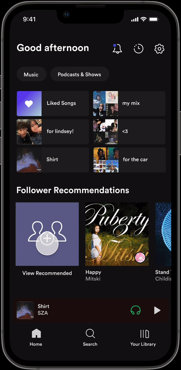
View your recommendations

Monitor recommendations
THE PROBLEM
A conversation I’ve had too many times…

Did you even listen to the song I sent you?
If sharing songs from Spotify is your love language, then you know the grueling process that it takes to recommend a song to a friend. You share the song link in a text message and then wait. Sometimes, they might say “I’ll listen to it later!” or maybe they’ll just heart the message and move on.
The current way of sharing a song from Spotify is unsystematic because there’s no standardized way to receive feedback on recommendations. This particularly frustrating if you don’t know whether or not your friend listened to what you sent.
How might we enable users to share and monitor song recommendations to allow for friends to connect on more meaningful levels?
UNDERSTANDING OUR USERS
I interviewed 6 music enthusiasts to understand their song-sharing processes.
My research goal was to identify key pain points users face in Spotify’s music-sharing process, as well as how current methods could be more streamlined to fit user needs. Here's what I asked and some findings:

The major takeaway? People want efficiency and organization.
To share music, users want a familiar and easy-to-use interface. While texting Spotify links externally seems to fulfill this need, the process of doing so is lengthy and untrackable. Keeping tabs on whether friends have listened to your music recommendations can be frustrating if you’ve shared a song with multiple people.
IDEATION
We got to brainstorming solutions by affinity mapping the problem space.
I recruited my good friends (and music nerds) Lindsey and Melika to help brainstorm two solution spaces that were the most important: song recommendation and listening status. From this, we landed on an idea: Spotify in-app sharing.

Wait… Spotify removed their previous direct messaging feature?


In 2017, Spotify removed a direct messaging feature because of low user engagement and high resources for maintainenance. Due to this, I kept two things in mind during feature ideation:
Visually bring the songs to the forefront instead of DMs to organically and intuitively encourage engagement.
Build into the existing interface to use the least resources.
As a reminder, one of Spotify’s central functions is to stream music. Before I started creating anything, I was mindful that this feature should not dilute Spotify’s brand identity to represent other regular social media apps. The music comes first.
I explored two flows: one for sending songs and one for viewing received songs.

TIME TO ITERATE!
Deciding an entry point
I came up with three ideas for accessing recommendations.

Upper navigation was too crammed and could be a potential accessibility issue with the closeness of the hitboxes, and bottom navigation was too prominent, shifting the design of Spotify into one more reminiscent of social media platforms. Upon reflection, the home page entry point was the best because it matched the design of existing features such as Spotify Blend; this would be a familiar design for users to interact with.
An intermediary page to connect the two flows
Based on feedback, I wanted to find a way to connect the two flows on a centralized page.

Clicking into two pages was the most effective. The most recent song recommended to the user is at the top and the size of the song establishes a strong visual hierarchy that puts the song at the forefront of the recommendation. The user’s recommended songs to others were smaller due to the amount of desired information users may want, and the stacked profile pictures kept track of who songs were sent to.
Selecting followers to share your music
Once the share button is clicked, how would users actually go about selecting the people they want to share with?

I went with the list view to select followers because it aligns with Spotify’s existing interface for when you view a user’s followers/following. This is also the least crammed out of the screen options which allows for a familiar vertical visual flow of information.
Listening status and monitoring recommendations
One of the main insights gathered from user research was that there is a need for an efficient way to keep track of the status of songs you recommend to others. I designed a page that would highlight the listening status of the song that was recommended, as well as whether they liked the song.
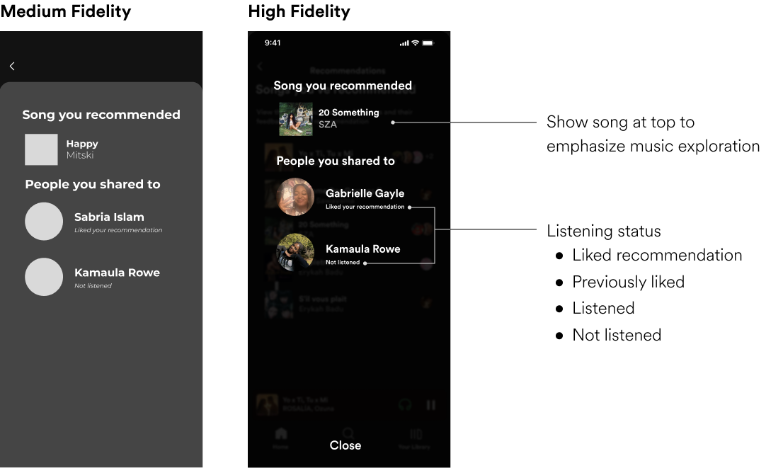
In my high-fidelity screen, I utilized a more familiar look that uses Spotify’s existing visual design. The information hierarchy also brings the song to the forefront, which not only serves as a functional reminder of the song being shared, but also establishes Spotify as a music-centered app rather than a social platform.
VISUAL DESIGN
To align with Spotify's existing designs, I made a UI kit from scratch

THE FINAL FEATURE
After prototyping and some preliminary user testing, Spotify Share was born!
The final feature includes an efficient way to access both songs recommended to you and songs that you’ve recommended. You can also view the status of a song that you’ve recommended, addressing pain points from my original user interviews.
Sharing a song
Viewing your recommendations
Monitoring recommendations
Upon testing my designs with users, I also prototyped entry points for monitoring recommendations in the intermediary page, which reduced an additional click to monitor from recently shared songs.
OUTCOMES
90% of users felt they were very or extremely likely to utilize the feature if launched!


If this concept were to be launched, some other metrics I would hope to measure are number of song shares, click-through rates, and average session duration within the feature.
TAKEAWAYS
User research is the foundation of it all.
Throughout my design process, I had to think critically and empathetically about each decision, connecting it back to insights from my user research. This made sure that what I was creating would effectively address the problem space.
The design process will not always look the same.
I did not have as many constraints compared to what I've experienced on other projects in this portfolio. I've grown to value this particular experience because I was allowed to let my creativity run freely, and ideate with full ownership.
The big picture: humanizing design not just gratifying, but necessary.
Music is a shared language that is powerful in developing deep connections with others. With the proper tools and features, we have the opportunity to extend this language and create a vehicle for connecting to others.