

Collidasphere
Designing a social media app that values authenticity, ownership, and customizability.
Role
Product Designer
Timeline
October to December 2022
Team
2 PMs, 4 Product Designers
Tools/Skills
Figma, User Research, Usability Testing
SUMMARY
Over the course of 12 weeks in 2022, I undertook a client project with an early-stage startup, Collidasphere, a new social media platform that aims for users to represent themselves authentically with versatile content mediums. Their mission is to “implement real-life interactivity in a digital space.” In a team with 3 other designers, I ideated the platform’s MVP and took ownership over designing a profile feature that emphasizes customizablility.
PROTOTYPE OVERVIEW
Represent yourself authentically, showcase your interests, and find communities.

Your profile and communities

Browse content from friends
THE PROBLEM

Social media encourages authenticity conformity.
Ever have that looming thought when making a post online that “I won’t get enough likes” or “I don’t look good enough”? There’s a reason for this—numerous social media platforms push creators into uniform content styles and put pressure on having successful metrics to compete with others.
Over 1/3 of teens on social media say they feel pressure to post content that will be popular and get lots of comments or likes. This can make users feel restricted in posting content they truly want to put out.
UNDERSTANDING OUR USERS
I interviewed 10 Gen Z social media users to understand how they choose what to post

Our interviews suggested that current users of social media are frustrated by the pressure of curating posts, which puts pressure to conform to one-dimensional self-representations. This led us to ideate highly customizable features to enable users to represent themselves in as many ways possible. We arrived at a critical question:
How might we design a social media app that centers on user authenticity, ownership, and customizability?
IDEATION
Turning a complex question into tangible designs required us to define key features
Our client wanted a main home page as opposed to a traditional navigation bar to scale out more pages as the platform grows. We decided to follow this information architecture and split up its core features below.

From scratch, I sketched out feature concepts to explore four key flows
Given the nature of the application being an early-stage product, I created low-fidelity sketches of what features could look like. Here are preliminary ideas for the app’s core sections: Home (originally Private), Flow, Create, and Profile.

My concept sketches addressed the original “How Might We” question in the following ways:
Allowing for ownership: Users can control the visibility of posts within their profiles and within groups (communities).
Posting authentically: Enabling images, writing, drawings, and stickers in posts encourages creative mediums that are centralized and diverse. Users can post to groups to reach a targeted audience of common interests.
Controlling your experience: Customize your own timeline to curate certain content from groups you want to see.
PROFILE FEATURE EXPLORATIONS
An even more complex design challenge emerges…
I moved on to the creation of the profile feature, which would allow users to categorize their posts into folders, view the groups they are a part of, and see their collisions (friends). I landed on another question that would guide my creation of the profile:
How might we design a profile feature that resonates with users’ authentic interests and allows for customizability to authentically represent who they are?
Folders to organize your posts in any way you see fit
Folders encompass your past posts. You can archive your posts by interest, time, or any way you'd like.

I went with the third option because users can customize the size of their folders, thereby enabling them to highlight folders of greater personal significance. The smaller name and profile picture de-emphasizes the person posting and shifts the focus to the actual content.
See groups you're a part in a quick overview
Groups are like communities, where you can connect to people of common interests.

I decided to go with the third option to account for the amount of scrolling that users would go through if they joined many groups. Also, it may be more familiar for users to recognize a group based on the consistency of its name rather than a thumbnail image
Collisions are your friends
Finally, here are a few designs created for the Collisions section:

While it seems that the list view would be familiar to users, I received feedback that it may feel too “roster-like” in traditional social media. I went with the three-column grid because it allowed for optimal use of space while breaking the “roster-like” feeling of traditional social media follower lists.
REFINING THE LOOK
I created 20 visual design explorations to strike a balance between clean and innovative
I used the Flow (feed) feature as a general template to explore visual designs. From this, we deduced it down to 5 screens.

While we were close to choosing Exploration D to serve as a basis for our designs, but user feedback suggested it was too overstimulating given the expansive features the app supported. We went with Exploration E for the following reasons:
Visual Branding: Our client advocated for a cohesive blue and gold color scheme.
Strong Visual Hierarchy: “Recents” indicates new post; Groups are shown by the plus icon and text description.
Hidden Interaction Count: Users click into posts to like or comment, breaking the pattern of mindless scrolling.
Refining the visuals of the profile section
After this, I went in and created our high-fidelity screens for the profile feature.
We also created the Collidasphere design system from scratch

THE FINAL PROTOTYPE
After countless hours of perfecting pixels, my profile feature was born!
Your profile and communities
Browse content from friends
After prototyping the final screens, I conducted user testing to identify pain points in the feature’s usability. There were two main issues that users had when it came to navigating the feature:
🚨 Problem 1: The term “Collisions” was confusing and not intuitive when users want to find their friends.
💡 Solution: Added into the onboarding process an explanation of unfamiliar terminology for new users.
🚨 Problem 2: The interaction to go back to the landing page was not intuitive (the bottom-left profile button).
💡 Solution: Due to client demands we kept the button, but implemented a long-hold option to improve accessibility.
OUTCOMES
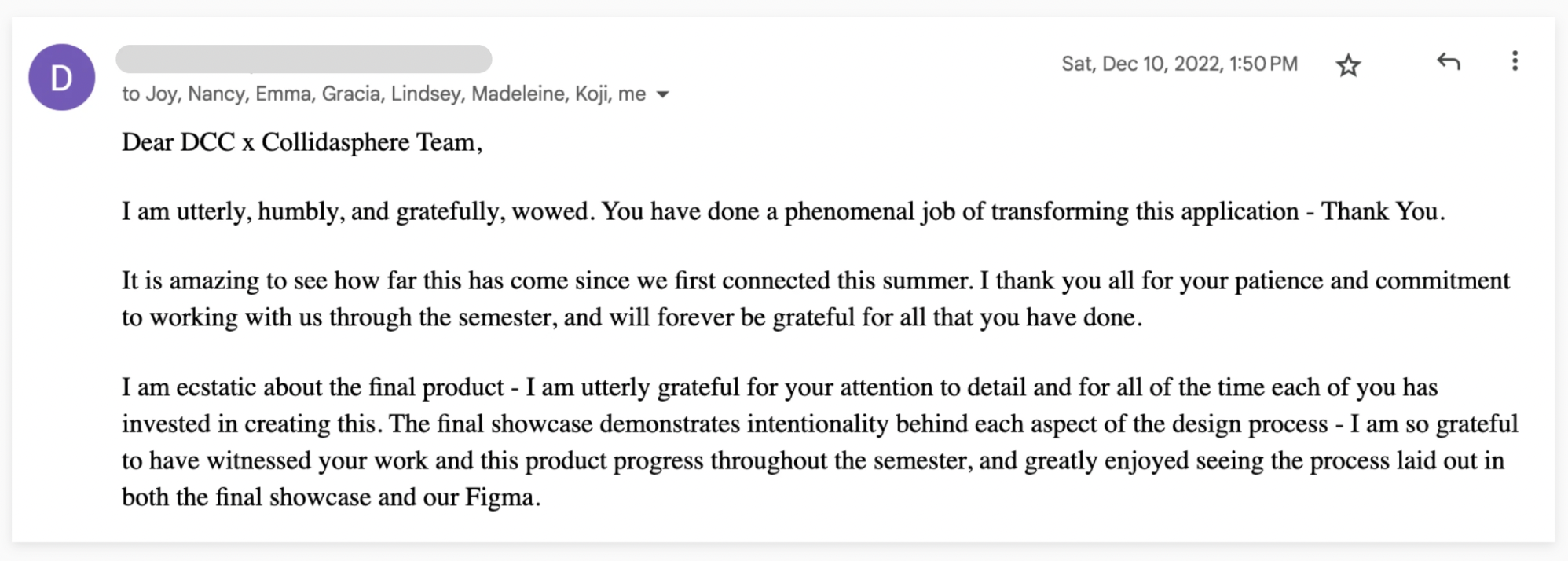
Our client loved the work we did.
In an email to our team:
What’s next for Collidasphere?
We organized our file for client and developer handoff. When launched, several success metrics for the app and my feature I would hope to measure are user retention, frequency of created folders, and feedback from user surveys.
TAKEAWAYS
Advocate for the user, always.
When disagreements came up within the team or with our client, we made sure to have an evidence-based approach for making design decisions. This entailed looking at our user research closely to move forward.
Bring intentionality to every decision.
I had to consider many tradeoffs in the creation of my feature. Weighing these tradeoffs through the lens of users was crucial, regardless of how minute they seemed.
Communicate ideas for team alignment.
Working in a team of other designers taught me the importance of communicating my design decisions. In order to create a cohesive app, I had to consistently articulate my ideas in a way that aligned our team.